
Are place-based policies targeting the wrong distressed areas?
Geographic inequality hit a new high in 2023

Today’s post is from economist Jed Kolko, who writes a monthly column for Slow Boring (you can read last month’s column here). Jed served for two years as Under Secretary for Economic Affairs in the Department of Commerce, where he oversaw the Census Bureau and the Bureau of Economic Analysis. He was previously chief economist at Indeed and Trulia.
Despite a decline in overall income inequality in recent years, geographic inequality continues to rise and is at a many-decades high, and geographic mobility has declined.
With fewer Americans moving, and geographic inequality widening, there’s been renewed research and political interest in policies that bring economic opportunity to distressed areas. Federal programs targeting these areas use different measures to determine eligibility, and different measures give different answers — places with high unemployment might still have rapid job growth, while some high-poverty places have highly educated populations and weather economic shocks well.
More troubling is that many programs base eligibility on income measures that don’t consider the huge differences across America in local cost of living. Failing to account for the local cost of living masks economic distress in many expensive metro areas, such as Los Angeles and Miami, which raises a billion(s?)-dollar question: Is federal money for distressed areas going to the wrong places?
The stubborn rise of geographic inequality
Geographic inequality continues to rise in the US. The gap in average local incomes between richer and poorer places was wider in 2023 than at any point since at least 1969, when the data series begins. The increase in geographic inequality is more about the richest places pulling farther ahead than the poorest places falling farther behind, and even the lowest-income places have seen gains in inflation-adjusted income since 1980. Average incomes have been rising especially sharply for the very richest places starting around 2011.1

This baseline measure of geographic inequality (the heavy green line, above) reflects market income — which includes labor income like wages and other earnings as well as capital income like dividends and interest — but not government transfers like Social Security and unemployment benefits. Two alternative measures of income show a lower level of geographic inequality but still trending upward.
The first alternative measure includes government transfers. Transfers tend to go to places where labor and capital income are lower — e.g. in retirement communities per-capita Social Security income tends to be high while per-capita wages and salaries tend to be low. Including transfer income makes things look somewhat more equal: geographic inequality for income including transfers is lower and rising more gently than for market income. Note that inequality of income including transfers fell markedly in 2020, when pandemic-related government transfer payments jumped.
The second alternative measure adjusts market income for differences in local cost of living. Higher-income places are more expensive to live in, mostly due to higher housing costs. Adjusting for the cost of living lowers geographic inequality, but the trend remains the same: inequality is rising and reached a new high in 2023. However, adjusting for the cost of living changes which places are richer and poorer, as we’ll see below.
The continued rise in geographic inequality contrasts the recent national decline in income inequality. The tight labor market since the mid-2010s, excluding the worst months of the pandemic, has pushed up wages most for people at the low end of the wage distribution. Transfers and tax policies have also contributed to a decline in income inequality.
Why has geographic inequality risen even as overall income inequality declined? Faster-growing, high-wage sectors like tech, finance, and professional services have clustered in specific places in order to take advantage of “agglomeration economies,” which are especially strong for industries with highly educated or specialized workers. At the same time, many of these places where tech and other professional industries cluster have built too little housing; high housing costs price out lower-income people, adding to geographic inequality. As a result, some of the places where average incomes have risen most since 1980 — like Boston and the San Francisco Bay Area — have had relatively slow population and employment growth. Tech clusters developed (and average incomes rose) outside the largest metros in places that built more housing, like Austin, Raleigh, and Provo-Orem (Utah). But these success stories are the exception, not the rule. For the most part, during the years of rising geographic inequality since 1980, richer places have stayed richer, and poorer places have stayed poorer.
Which places are left behind?
Rising geographic inequality, combined with declining geographic mobility, have fueled efforts to help places left behind. But which places need and deserve help? The answer depends on which economic measure you look at:
Unemployment: The highest unemployment rates in the US are along the Mexican border in neighboring El Centro CA and Yuma AZ, and in several inland California metros including Bakersfield and Fresno. Unemployment is lowest in several Midwest, Plains, and New England metros, such as Sioux Falls SD, Burlington VT, and Madison WI.
Job growth: The metros with the steepest job losses since 2000 are concentrated in the Great Lakes region and upstate New York, including Youngstown OH, Flint MI, and Binghamton NY. Places that experienced major disasters also can suffer long-term job loss, like New Orleans after Hurricane Katrina.
Poverty (and income): Poverty rates are highest along the border in Texas, including McAllen and Brownsville, as well as in smaller metros across New Mexico, Louisiana, and Georgia. The official poverty measure is determined by whether a family’s or individual’s income meets a threshold level that depends on the number and age of family members; poverty rates and local average income are therefore highly correlated.
Education: While education isn’t a traditional economic indicator, local educational attainment is an important measure of economic distress. Over the long term, higher-education places grow faster and, critically, adapt better to economic shocks. The metros with the lowest share of residents with college degrees include some high-unemployment areas of inland California, high-poverty metros along the Texas border, and job-losing metros in Ohio and West Virginia.
These measures tend to be correlated. Places with higher education attainment have higher incomes and lower poverty rates, and often lower unemployment and faster job growth. But these distress measures sometimes send mixed messages, with the same place scoring well on one and poorly on another. For instance:
Places with slow job growth or even job losses sometimes have relatively low unemployment rates. People leave, or don’t move to, places where jobs are scarce. For instance, Pittsburgh and Milwaukee lost jobs since 2000 but have lower unemployment rates than fast-growing Las Vegas and Riverside CA.
College towns have high poverty rates since many residents are students, who tend to have low incomes, but fare better on other measures of distress. Poverty is high in College Station TX (home of Texas A&M), Columbia MO (U of Missouri), Auburn AL (Auburn U), Iowa City (U of Iowa), and State College PA (Penn State) — rivaling poverty rates in inland California and job-losing Great Lakes metros — but college attainment is high and unemployment is low.
Another reason these distress measures send mixed messages is that some fluctuate over time while others change little. Local unemployment and job growth can swing up or down quickly, especially where local economies depend on industries that boom and bust, like mining, construction, or tech. Local poverty rates, average incomes, and educational attainment change much more slowly over time; they are a better reflection of long-term economic fundamentals and potential than of current economic performance.
The pandemic illustrates this disconnect. The pandemic job recovery was weakest in San Francisco, where employment is almost 13% below where it would have been had the pre-pandemic trend continued. Employment is 10% below trend in three other tech-heavy west coast metros: Portland, Seattle, and San Jose. Job losses during the pandemic were higher in expensive places, as people moved to more affordable locations, and in places with industries like tech and finance where more people could work from home and spent less at local retail and service establishments.
But most of the places where employment is farthest below the pre-pandemic trendline are not distressed on other measures. Many, like the west coast metros plus Minneapolis and Boston, are high income and have high educational attainment. Others, like Palm Bay FL, Riverside CA, and Orlando, continue to have strong job growth, but not as fast as their exceptional job growth pre-pandemic.

Few places look distressed on all measures. Only a handful of metros fall in the highest quarter on all five measures of distress (high unemployment, slow job growth, high poverty, low income, low education): Toledo OH, Springfield MA, Youngstown OH, Flint MI, Beaumont–Port Arthur TX, and some smaller metros.
Federal programs that target distressed areas use one or more of these measures or close variants. Average (or median) income, poverty, and unemployment most commonly determine whether a metro area, county, neighborhood, or other geographic area qualifies as distressed. One agency might use different distress measures for different programs: the Economic Development Administration, for instance, considers local unemployment and per capita income for its Public Works and Economic Adjustment Assistance program, while the employment-population ratio is the key qualification for the Recompete economic development program. The fact that different programs use different measures can be a hassle for localities trying to figure out which programs they qualify for, but reflects that distress is multidimensional and different federal programs can have different goals and therefore different qualifications.2
The impact of local cost of living
Using income or poverty to measure local distress raises a bigger issue. When measuring distress to determine local eligibility, federal programs tend not to adjust for geographic differences in the cost of living. This is not for lack of data. The Bureau of Economic Analysis publishes a local cost of living measure annually for nearly 400 metro areas and the non-metro portions of states. Recently released data for 2023 showed that the most expensive large metros are San Francisco, Los Angeles, Seattle, San Jose, New York, and Miami. Housing drives most of the differences in local cost of living, and the cost of other goods and services is higher where housing is more expensive because nonresidential real estate prices and wages tend to be higher in those places, too.

The Census Bureau publishes an alternative poverty rate — the Supplemental Poverty Measure (SPM) — that improves on the official poverty measure (OPM) by taking local cost of living into account as well as adding in non-cash government benefits and subtracting necessary expenses and taxes. The OPM considers only pre-tax cash income and does not factor in local cost of living differences. These technical differences have a big impact. At the national level, the SPM shows that pandemic relief efforts temporarily reduced poverty, especially child poverty.
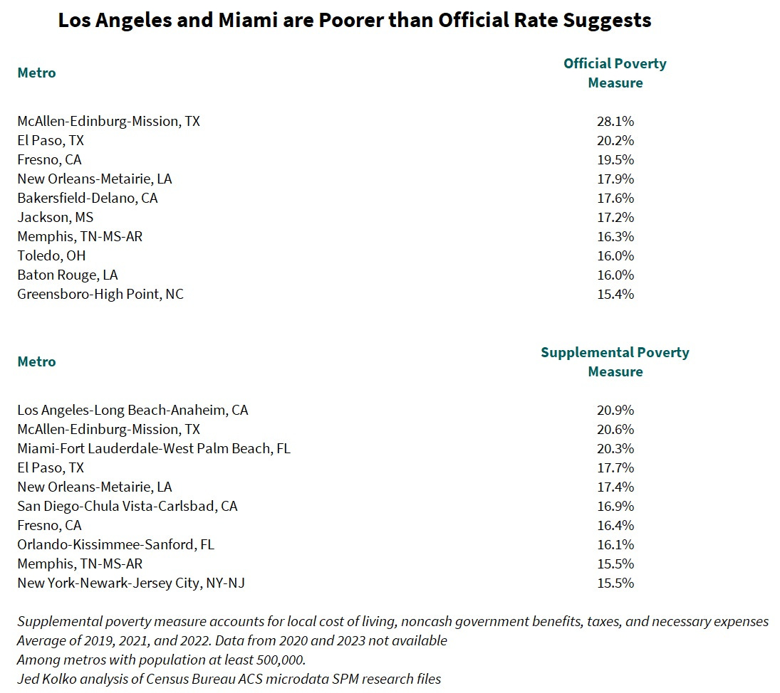
At the local level, the differences between the OPM and SPM are similarly striking. By the official measure, among larger metros, poverty is highest in McAllen-Edinburg-Mission and El Paso, on the Texas border, plus the inland California metros of Fresno and Bakersfield, as well as New Orleans. But according to the SPM, poverty is highest in several expensive metros, with Los Angeles and Miami among the top three, and San Diego, Orlando, and New York joining the top-ten list.
In general, larger metros are more expensive than smaller metros, which in turn are more expensive than micropolitan areas and the largely rural counties outside metropolitan and micropolitan areas. By the official measure, poverty is highest in rural counties and micropolitan areas. But according to the supplemental measure, poverty is highest in the largest metropolitan areas.

So are we sending money to the wrong places? You’d have to look in detail, program-by-program, to see how much money would go to different places if allocated by cost-of-living adjusted income or the SPM, instead of unadjusted income or the OPM. Further, there are reasons not to reallocate federal money based entirely on adjusted income or the SPM. First, in places where a high cost of living contributes to local poverty, a poverty-fighting strategy is building more housing, which is more a local and state responsibility than a federal one. Second, some places have relatively low incomes and high housing costs because they appeal for non-economic reasons — that is, places like Los Angeles and Miami offer “compensating differentials” that draw people there, which holds down wages while driving up rents. Economists have even ranked metros by quality of life this way; one analysis put Honolulu on top and Houston at the bottom. To the extent that lower cost-of-living adjusted local incomes reflect sunshine and beaches, federal policy shouldn’t aim to fully equalize cost-of-living-adjusted incomes. Perhaps the simplest implication is to rely more on employment- and education-based measures, rather than income measures, to identify and target distressed areas.
The geographic inequality measure is based on Bureau of Economic Analysis personal income data and includes all metropolitan and micropolitan areas as well as counties outside metro/micro areas. Official and supplemental poverty measures are based on calculations using the Census Bureau’s American Community Survey microdata research files. Pandemic-era job growth is based on Bureau of Labor Statistics’ Current Employment Statistics. Annoyingly, BLS currently reports metro-level data using vintage 2018 metropolitan area definitions, BEA uses vintage 2020 definitions, and Census uses vintage 2023 definitions.
Place-based industrial policies, which have been a hallmark of the Biden-Harris Administration, are in a separate bucket. These programs direct investments to places that have specific local assets or capacity that will contribute to national goals like technological innovation, semiconductor production, or clean energy production. Many of these investments have gone to places with lower incomes and less education even though their primary intent is not to target the most distressed places.
It strikes me that all the distortions referred to in this article would be significantly mitigated if housing supply were even somewhat responsive to housing demand. Housing shortages are strangling everything. Literal rent seeking.
If there was enough housing supply growth such that housing costs could stay in the 25-33% of income sweet spot in basically all localities people would be moving to where opportunities were, young people would be forming new households, I bet TFR would be a few ticks higher, economic growth would be faster, people would almost certainly be more chill in politics and you wouldn't have such massive distortions on what the definition of poverty is based on whether you adjust for local CoL.
It's housing all the way down.
I think we're starting from a presumption that regional inequality is an ill that must be cured, which isn't obvious at all to me. In fact, the spatial concentration of certain industries seems like an indication of efficiency. Coal mining is never going to be as productive as tech, but we certainly wouldn't want to reallocate 50% of tech to West Virginia and make 50% of Californians go look for some coal to mine out there. On this basis, it seems appropriate for WV to be poorer than CA. Ideally, we'd just want the smart kids from WV to be able to move to CA if they got interested in tech, so maybe measures related to education/mobility are most appropriate. (But keep in mind that human capital is heritable through several channels...)
Anyway, each program is trying to accomplish some specific thing, so it's probably appropriate to just ask "what are we trying to do?" for each program and come up with a corresponding measure to decide how to allocate the money. It's not really clear that in most cases, the marginal benefit of allocating money somewhere is going to be related to some sort of inequality measure. (At least we haven't seen the evidence here.)